A New Club with Old Roots: Hexham Town FC's Brand Identity
About CLUB ROOTS
I’m Jacob Mistry, the one writing these blogs, designing the logos, and obsessing over how non-league football clubs can grow their potential. I’ve been part of the non-league world for years, so I get it—the graft, the passion, and the challenges.
CLUB ROOTS is my way of helping clubs like yours look the part, attract bigger sponsors, and build something that lasts. Whether it’s a complete rebrand, merch designs, or graphics for matchday, I’m here to make your club stand out.
- Logo & Brand Design
- Matchday Graphics
- Merch & Apparel Design
- Social Media Templates
I know budgets are tight, and volunteers are few. But with the right branding, your club can grow into something bigger—without losing its identity.
FULL CASE STUDY
Hexham Town FC is a club born from ambition and pride in its community. When a former professional footballer from Hexham decided to start a team representing his hometown, he wanted more than just a team—he wanted an identity.
He reached out to CLUB ROOTS to craft a look and feel that would honour Hexham’s rich history while setting the club up to grow quickly in the modern football world. He envisioned something historical yet clean, vintage-inspired yet forward-thinking. We took this brief and delivered a brand identity that’s not just a logo but a symbol of the town’s passion and potential.
This case study is fictional and created for portfolio purposes to showcase our design process and what CLUB ROOTS can do for non-league clubs. Hexham Town FC is not a real club, but the branding shown here demonstrates the possibilities for your club.
Research: The Town and Its History
Hexham is a town steeped in history. From the ancient charm of its market square to the iconic Hexham Abbey, every corner tells a story. For a club representing Hexham, we knew its brand had to reflect this heritage while appealing to modern football fans and players.
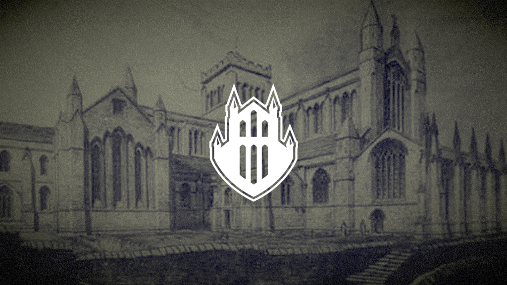
We focused on Hexham Abbey as the cornerstone of the identity. Its silhouette is instantly recognizable and deeply tied to the town’s character. By narrowing down to this key element, we avoided the pitfalls of overcrowding the design with too many details, ensuring the brand would remain clear and impactfu

Sketching the Ideas
Before diving into software, we started with pencil and paper. Sketching helped us explore ideas inspired by the Abbey and refine them into a strong, simple logo concept.

Turning it Digital
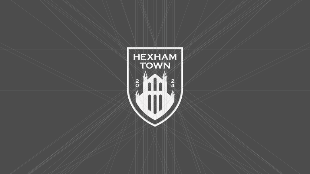
With the sketches refined, the design was brought to life digitally. A precise grid system ensured symmetry and balance in the final badge, giving it a clean, professional edge.
Typography: A Bold but Refined Choice
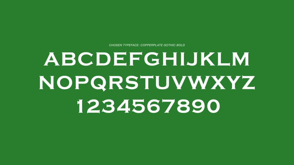
We selected Copperplate Gothic Bold as the typeface for Hexham Town FC. Its style matched the feel of the Abbey, it’s strong, clean lines strike the perfect balance between vintage charm and modern clarity, aligning with the club’s vision.
Colour Palette: Inspired by Hexham’s Landscape and Heritage
All three main colours were inspired by the historical Hexham Coat of Arms, ensuring tradition is tied into every image of the club. The green also pays homage to eye-catching countryside that surrounds the town. The blue nods to the River Tyne that runs through the town.

Social Media Graphics
With the font and colour palette decided, it was ime to put together a collection social media graphics. The club wanted to look classy, whilst retaining an element of simplicity to allow them to update them from game to game. We produced starting XI, next match, full time, half time, and goal graphics.

Kit Design
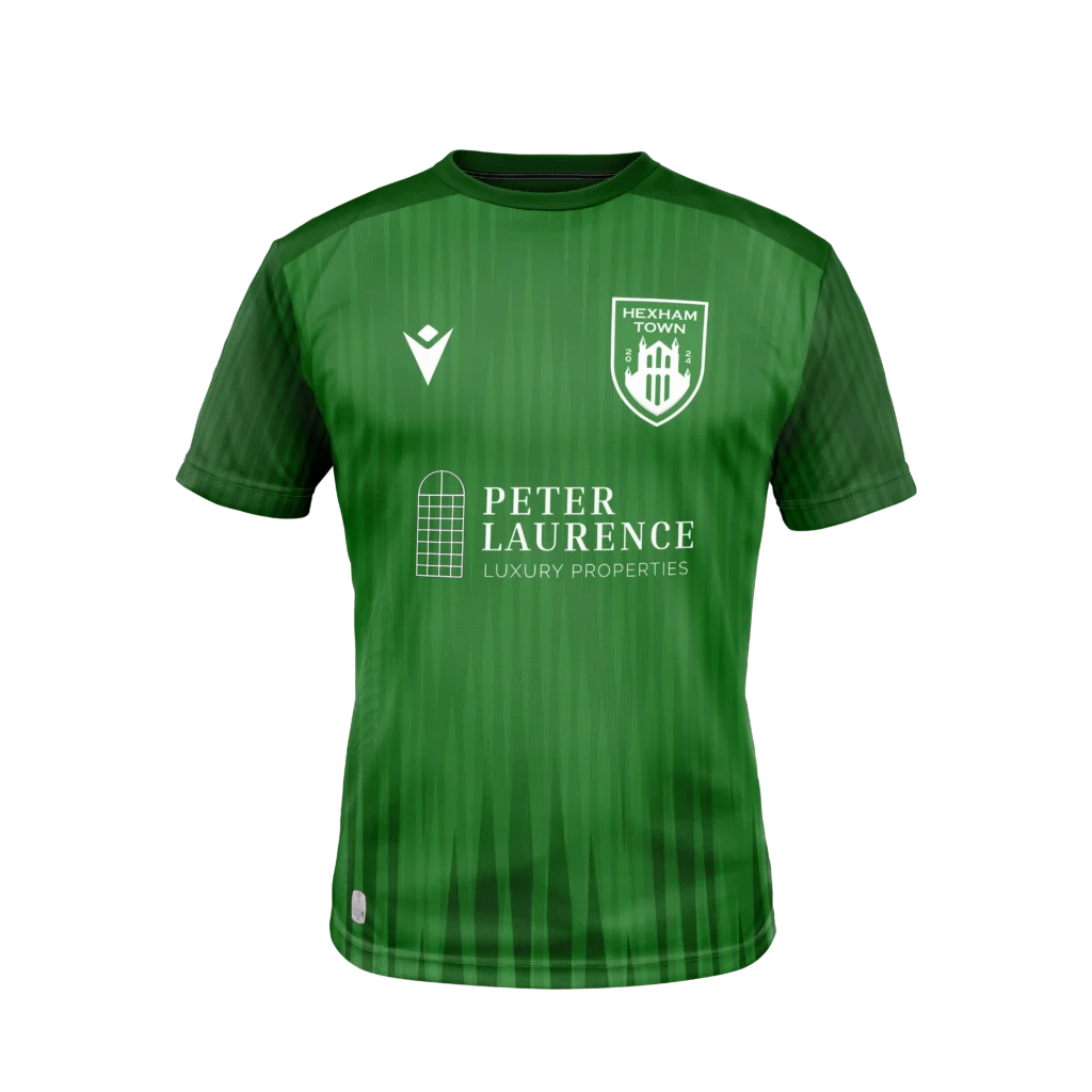
Next, we put together a clean, modern and stylish home kit design. The colourway remains true to the green of Hexham, whilst being textured with a pattern or spires, a nod to those on the Abbey.
The Secondary Logo
Recognizing the need for versatility, we designed a secondary logo that focuses solely on the Abbey silhouette. Framed with a strong stroke, this minimalist version is perfect for merchandise, social media icons, and situations where a full badge might feel too detailed.
This scalable design ensures the brand remains impactful at any size, whether on a player’s shirt sleeve or a coffee cup.
The Final Badge
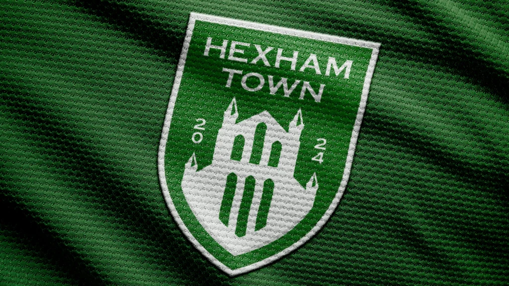
The finished Hexham Town FC badge is a proud representation of the town’s heritage and future. It’s versatile, professional, and ready to grow with the club.


Hexham Town FC may be fictional, but the process and principles behind this design are very real. If your club is ready to step up its branding game, let’s chat. A stronger brand isn’t just about looking good—it’s about attracting sponsors, fans, and players.