Lighting the Way: The Complete Rebrand of Flamborough Head FC.

About CLUB ROOTS
I’m Jacob Mistry, the one writing these blogs, designing the logos, and obsessing over how non-league football clubs can grow their potential. I’ve been part of the non-league world for years, so I get it—the graft, the passion, and the challenges.
CLUB ROOTS is my way of helping clubs like yours look the part, attract bigger sponsors, and build something that lasts. Whether it’s a complete rebrand, merch designs, or graphics for matchday, I’m here to make your club stand out.
- Logo & Brand Design
- Matchday Graphics
- Merch & Apparel Design
- Social Media Templates
I know budgets are tight, and volunteers are few. But with the right branding, your club can grow into something bigger—without losing its identity.
FULL CASE STUDY
Flamborough Head Football Club is entering a new chapter in its history. Established in 1981, the club has always been a staple of the local football scene, but until now, it lacked a clear identity. The badge was nothing more than a stock photo icon with the club’s name underneath—functional but far from inspiring.
Recently, the club received a much-needed boost in the form of investment from a local businesswoman who is passionate about revitalizing Flamborough Head FC and its role in the community. With this renewed energy, the club approached CLUB ROOTS to design its first-ever professional brand.
Our goal was to create a logo and identity that would reflect Flamborough Head’s stunning coastal heritage, the community’s passion for football, and the ambition of its new era.
This case study is fictional and created for portfolio purposes to showcase our design process and what CLUB ROOTS can do for non-league clubs. Flamborough Head FC is not a real club, but the branding shown here demonstrates the possibilities for your club.
Research: The Town and Its History
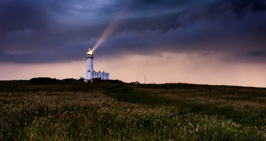
Flamborough is best known for its white cliffs, iconic lighthouse, and rich maritime history. We wanted the club’s new identity to feel deeply connected to this unique heritage while signalling a modern and ambitious future.
The lighthouse stood out as the perfect symbol for the club. A beacon of light, it represents guidance, strength, and resilience—values that align perfectly with the aspirations of Flamborough Head FC. The surrounding cliffs and crashing waves were also key inspirations, symbolising the community’s enduring spirit.
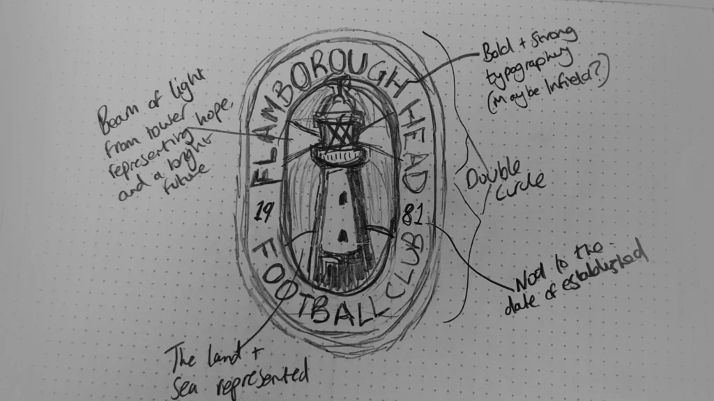
Sketching the Ideas
Initial sketches focused on integrating the lighthouse with other coastal elements. We experimented with circular and oval badge layouts to give the crest a traditional football feel while introducing a distinct identity.
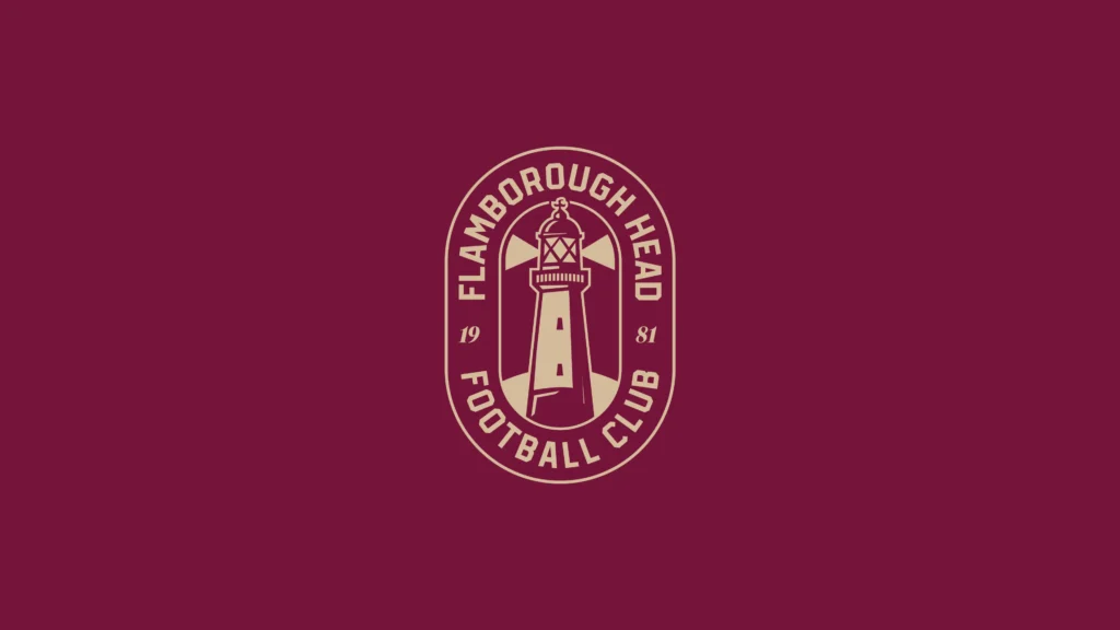
The final design concept features a double-circle oval shape, a modern twist that remains instantly recognisable as a football badge while standing out as unique. This approach ensures the club’s brand feels fresh and distinct while maintaining a connection to traditional football design.
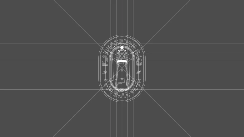
Turning it Digital
With the sketches refined, the design was digitised. A grid system ensured symmetry and balance in the badge’s layout, while clean, precise lines gave the design a professional edge.
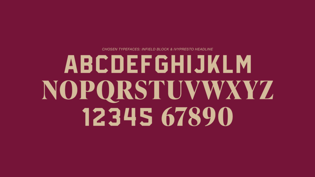
Typography: A Bold but Refined Choice
Typography played a vital role in building Flamborough Head FC’s identity. We paired Infield Block, a bold, classic sports typeface, with IvyPresto Headline, a refined and elegant serif. This pairing balances the energy of modern football with the sophistication of the club’s new era, ensuring the brand is as visually versatile as it is memorable.
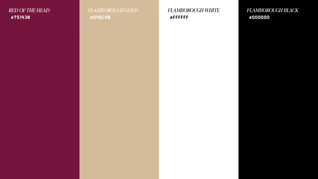
Colour Palette: Heritage Meets Sophistication
The chosen color palette draws inspiration from Flamborough Head’s landscape and maritime legacy, while also creating a brand that feels premium and professional:
- Deep Burgundy: Symbolizing heritage, elegance, and resilience.
- Light Gold: Representing sophistication, ambition, and the lighthouse’s guiding light.
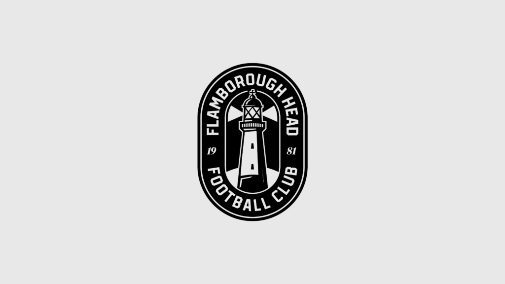
- Black and White: Providing strong contrast and adaptability for modern and traditional applications.
This combination ensures the badge feels timeless yet fresh, perfectly representing Flamborough Head FC’s ambitions.
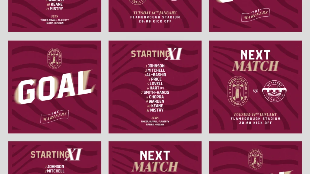
Social Media Graphics
With the fonts and colours chosen, it was time to put together a social media graphics collection. We included a line-up, next match, goal, substitution, sponsor shoutout and new signing graphic within the pack.
The Final Badge
The final badge brings all these elements together harmoniously. The double-circle oval layout adds a unique, modern twist to traditional football badge shapes, while the lighthouse, light beams, and cliff capture the essence of Flamborough’s identity.
Hexham Town FC may be fictional, but the process and principles behind this design are very real. If your club is ready to step up its branding game, let’s chat. A stronger brand isn’t just about looking good—it’s about attracting sponsors, fans, and players.