Rebranding Horbury Town FC for the Future
About CLUB ROOTS
I’m Jacob Mistry, the one writing these blogs, designing the logos, and obsessing over how non-league football clubs can grow their potential. I’ve been part of the non-league world for years, so I get it—the graft, the passion, and the challenges.
CLUB ROOTS is my way of helping clubs like yours look the part, attract bigger sponsors, and build something that lasts. Whether it’s a complete rebrand, merch designs, or graphics for matchday, I’m here to make your club stand out.
- Logo & Brand Design
- Matchday Graphics
- Merch & Apparel Design
- Social Media Templates
I know budgets are tight, and volunteers are few. But with the right branding, your club can grow into something bigger—without losing its identity.
FULL CASE STUDY
Horbury Town FC is a club with a proud history, but in an era where non-league football is more competitive than ever, a strong and professional identity is vital. Sitting in Wakefield, Horbury Town have just been promoted to the NCEL Premier Division (Step 5), marking a crucial moment in the club’s journey. Having only recently joined the semi-professional game, this is the perfect opportunity to establish an identity that reflects the club’s ambitions.
Local rivals Ossett United and Wakefield AFC have built extremely strong brands, setting the benchmark for clubs in the area. This rebrand is Horbury’s opportunity to match them off the pitch while continuing to compete with—and outdo—their neighbours on it.
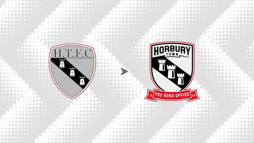
Before and After
The existing crest pays homage to Horbury’s history, featuring the three castles, a tribute to the first football team in the town, aptly named Three Castles. This symbol has been a staple across local churches and institutions, reinforcing its deep-rooted connection to the community.
The new design respects this legacy while refining it into a more modern and scalable format, ensuring the badge is timeless and effective across all mediums.
The badge now features a classic ribbon displaying the town’s motto, “Pro Bono Oppido,” this pays tribute to Horbury’s legacy while staying in line with the club’s modernised identity.
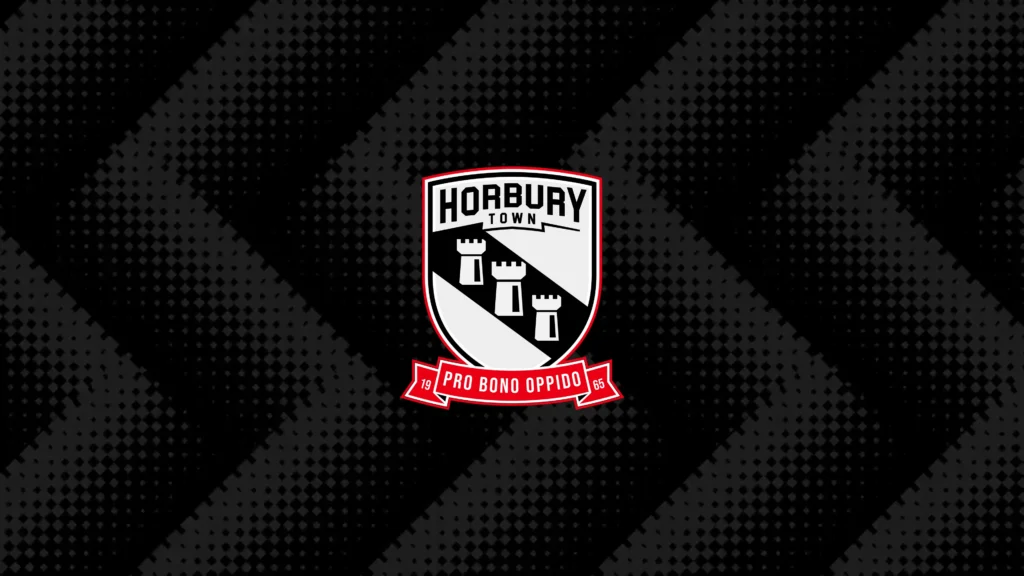
The New Badge in Black & White
A great badge needs to be versatile. Whether in full colour, monochrome, or simplified formats, the new Horbury Town FC crest maintains its impact across all applications—from kits to merchandise, print materials, and sponsorship placements.
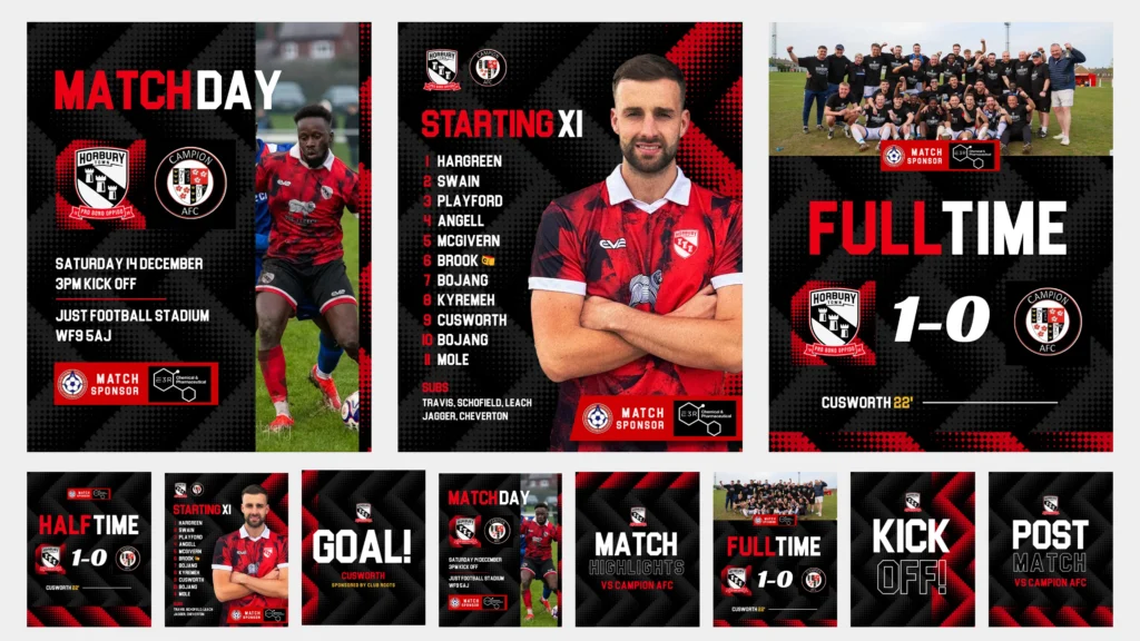
Social Media Identity
Modern football clubs thrive on strong social media presence, and Horbury is no exception. Alongside the rebrand, CLUB ROOTS would provide a complete suite of social media graphics—from matchday announcements to promotional visuals—ensuring the club looks as professional online as it does on the pitch. We would also complete a match day programme design.
Typography
Typography: The bold front, named Blockletter, reflects strength and stability, making it easily readable and striking across all club branding. This font choice is inspired by a well-known sign in the town that mimics the Hollywood sign, creating a unique local connection within the club’s identity.


Club Colours
- Main Red (#EB0015) – A deep, rich red representing Horbury’s passion and identity.
- Accent Red (#CC0002) – A darker, more intense red that adds depth and contrast.
- Charcoal (#131313) – A strong, grounding colour for depth and balance.
- White (#F5F5F5) – Clean and premium, ensuring contrast and a timeless finish.
- Gold (#F1BF66) – A refined touch to highlight prestige and tradition.

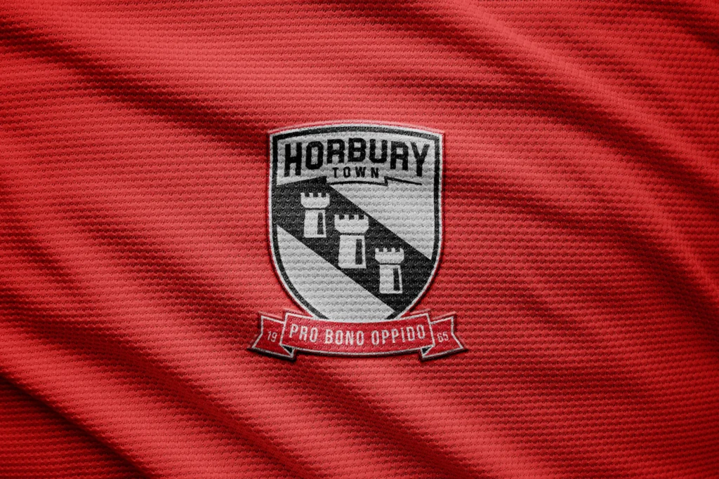
Bringing the Badge to Life
A badge isn’t just a logo—it’s an identity worn with pride. Here, we see how the new Horbury Town FC crest would look on a textured football shirt.

The Final Badge
This rebrand is about more than just a new crest—it’s about setting Horbury Town FC up for the future. CLUB ROOTS has ensured that the new identity stays true to the club’s roots by preserving and modernising the iconic three castles, making it a perfect blend of heritage and progress.
A fresh, modern identity will not only attract sponsors, players, and supporters but also strengthen the club’s presence in the competitive non-league landscape. With this new visual identity, Horbury Town FC is ready to step into the next chapter of its journey.