Wetherby FC: A Brand New Club, Ready for Rapid Growth.

About CLUB ROOTS
I’m Jacob Mistry, the one writing these blogs, designing the logos, and obsessing over how non-league football clubs can grow their potential. I’ve been part of the non-league world for years, so I get it—the graft, the passion, and the challenges.
CLUB ROOTS is my way of helping clubs like yours look the part, attract bigger sponsors, and build something that lasts. Whether it’s a complete rebrand, merch designs, or graphics for matchday, I’m here to make your club stand out.
- Logo & Brand Design
- Matchday Graphics
- Merch & Apparel Design
- Social Media Templates
I know budgets are tight, and volunteers are few. But with the right branding, your club can grow into something bigger—without losing its identity.
FULL CASE STUDY
Wetherby Football Club was just an idea in the minds of 2 local businessmen a mere 16 months ago. Today, we are happy to share the brand new club identity, as the team is set to launch.
The owners reached out to CLUB ROOTS to create their first ever brand. Their passion for the town and semi-professional football was at the heart of our conversations. It was clear they want this team to fly through the non-league pyramid, so our aim was to create a brand that is inspired by iconic landmarks, whilst being modern enough for rapid growth.
This case study is fictional and created for portfolio purposes to showcase our design process and what CLUB ROOTS can do for non-league clubs. Wetherby FC is not a real club, but the branding shown here demonstrates the possibilities for your club.
Research: The Town and Its History
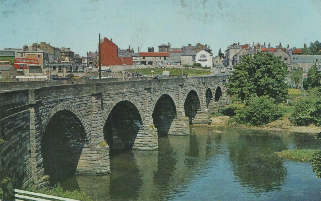
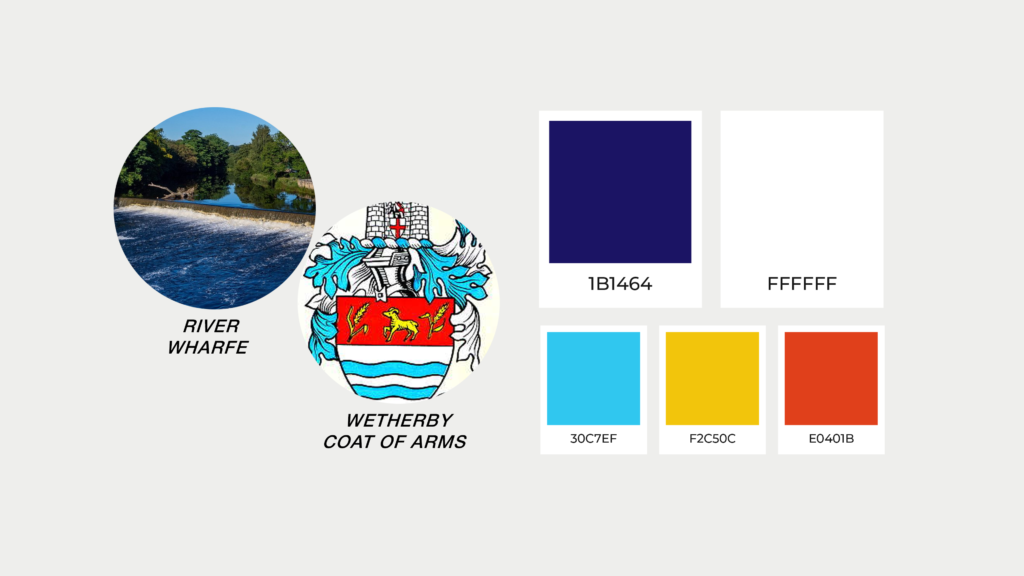
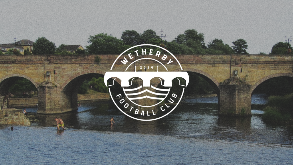
The project began with a deep dive into Wetherby’s identity. From its historical landmarks to its vibrant community, we explored what makes the town special. The Wetherby Bridge, an iconic structure spanning the River Wharfe, stood out as a powerful symbol of connection and strength. We also drew inspiration from the town’s coat of arms, with its distinct palette of blue, yellow, and red, to ensure the design would feel rooted in local heritage.
Sketching the Ideas
Initial sketches centred around the Wetherby Bridge, experimenting with different ways to stylise the arches and water. We explored abstract forms, bold geometric interpretations, and minimal patterns to balance tradition with a modern edge. These sketches also considered how the design could be adapted for a range of uses, from digital to print.

Turning it Digital
With the sketches refined, the design was brought to life digitally. A precise grid system ensured symmetry and balance in the final badge, giving it a clean, professional edge.

Typography: A Bold but Refined Choice
We selected Infield Block as the typeface for Wetherby FC. The bold block look had the classic sports feel, whilst being clean and strong enough to support the brand online and in-person.

Colour Palette: Inspired by Hexham’s Landscape and Heritage
The colour palette is a blend of history and nature.
- Primary Blue: Inspired by the flowing River Wharfe, symbolising calm and unity.
- Secondary Blue, Yellow, and Orangey Red: Drawn from Wetherby’s coat of arms, these colours tie the brand to the town’s history while adding vibrancy and versatility to the design.
Social Media Graphics
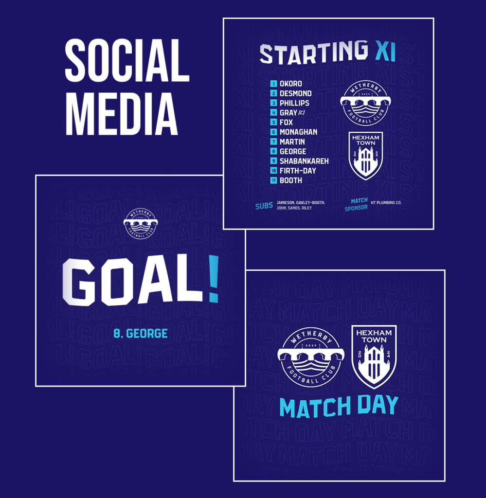
With the colours of the club and the typography sorted, it was time to put together a collection of match day posts. These are simple enough to be edited by volunteers with zero experience in design, but stylish enough to stand out and match the badge.
The Secondary Logo
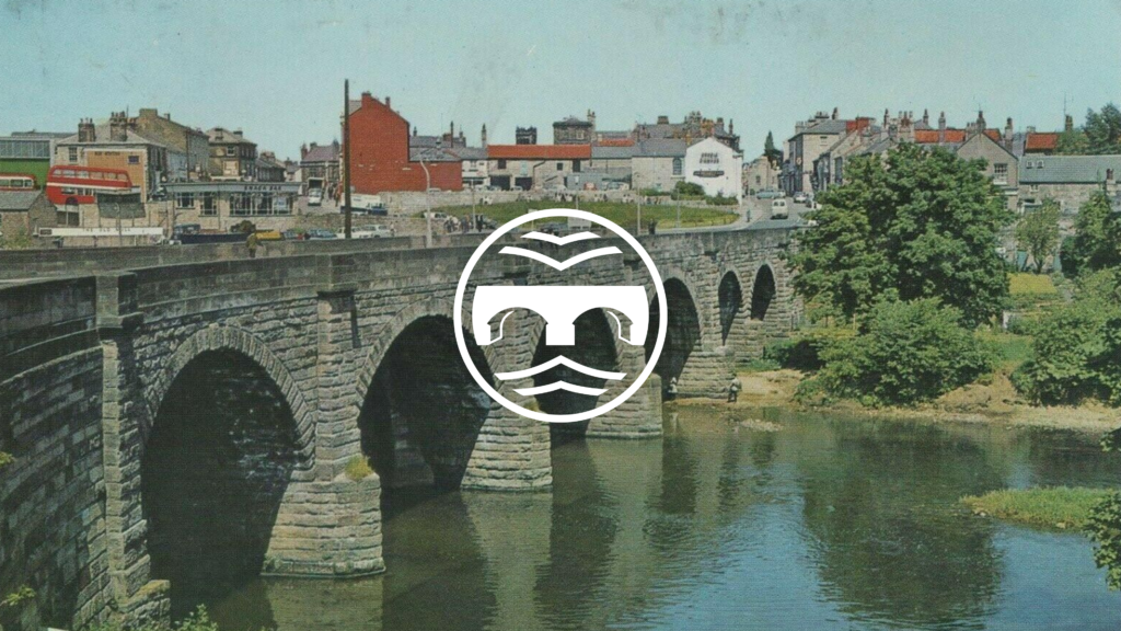
A minimalist version of the main logo was created to provide flexibility. This design focuses solely on the Wetherby Bridge and river elements, simplifying the visual while retaining its essence. It’s perfect for use in smaller applications like social media icons, merchandise tags, or watermarks.
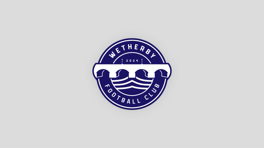
The Final Badge
The final design brings together all elements harmoniously. The circular layout, bold typography, and balanced colour palette work together to create a logo that is timeless yet modern. It reflects Wetherby FC’s ambition while staying deeply connected to its roots.

Wetherby FC may be fictional, but the process and principles behind this design are very real. If your club is ready to step up its branding game, let’s chat. A stronger brand isn’t just about looking good—it’s about attracting sponsors, fans, and players.